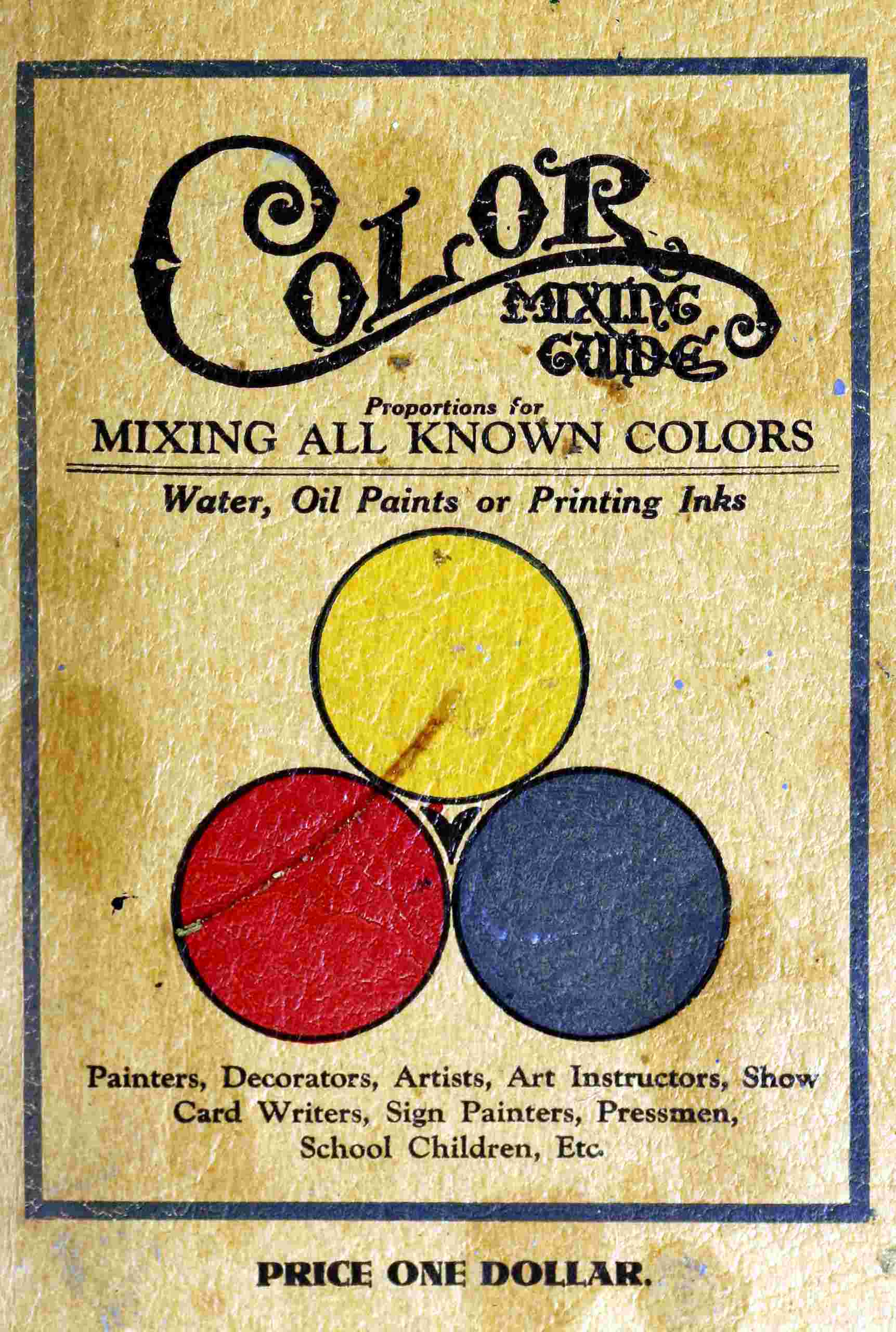
COLOR HARMONY
The secret of harmony is equal value, complementary colors are the color or colors which, with any color or colors mentioned, make the three primary colors, which constitute white light. For example if given color is a primary, its complementary color is composed of the other two primary colors; the complementary color of blue is orange, red and yellow. And if given color be a secondary, its complementary color is the remaining color. Thus the complementary color of green, blue and yellow is red.
It is well to bear in mind whether the subject to be treated is a landscape scene, color design, form to be printed in colors, sign or house painting that equal value of colors is the correct way.
Any subject that has been ill-treated with too much red, or colors which do not harmonize, form a combination that irritates.
When colors are correctly used the effect is soothing. Remember that red is the most irritating color and a little will balance well with a large amount of other colors.
The object to be painted or printed has a lot to do with the selection of colors. It is well to study the subject carefully.
Printing pressmen have their problems. When printing on white material which is a neutral color he does not encounter the obstacles as when printing colored inks on colored material.
All fine pictorial color printing is executed on white material, this being the only way to get pure coloring, as it is generally printed with transparent ink.