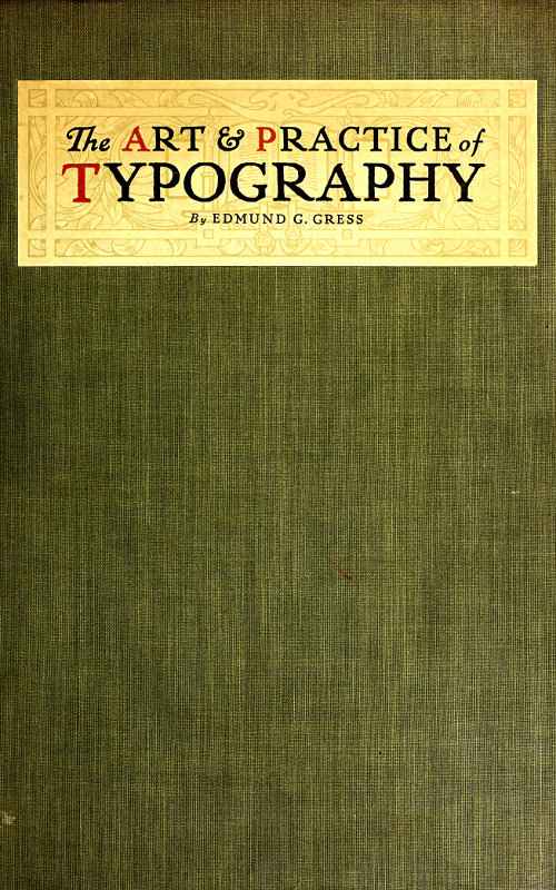
EXAMPLE 148
Where a French style of treatment is appropriate. Designed by Bruce Rogers
There is a rule that the running title should be separated from the type-page by space equivalent to a quad line of the size of body-type used, altho the best typographers prefer only about half that amount of space.
Pages containing chapter headings are lowered at the head below the regular page hight. Example 127 shows a lowering of five picas space. Other books show more or less than this amount of space, but the space allowed in this example is pleasing.
When an initial is used the space between it and the type should be the same, both at the right side and foot of the initial.
The position of a book page should be toward the binding and the head. In elaborate books of wide margins this inclination should be great, but in the conventional book of narrower margins it should be less noticeable—say six points toward the binding and eighteen points toward the head.
The use of an em-quad between sentences on a book page is encouraged by many printers, but the new-thought compositor uses two three-to-em spaces or less. By referring to example 127 it will be found that the same amount of space separates all words in one line. The capital letter seems sufficient indication of the beginning of a sentence. In the first book printed from separate types (see reproduction of page from Gutenberg’s Bible in the chapter on “The Origin of Typography”) there was no space used between sentences, the period in the judgment of the printer separating the words sufficiently.
EXAMPLE 149
Title-page lettering and decoration by F. W. Goudy, for the Caxton Co., Cleveland, O.
BOOKLETS, PAMPHLETS, BROCHURES, LEAFLETS
Did I wish to be flippant I would open this chapter by asking, “When is a booklet not a booklet?” and might even be pardoned for doing so, for no other word has been so misused as has “booklet.”
A booklet, the dictionaries tell us, is just a little book, as is indicated by the suffix “-let,” which termination forms diminutives from French and English nouns. Yet “booklet” has been used to designate not only little books, but big books, and has led to the rather tautological description, “a little booklet.” When does a booklet cease to be little, and is its littleness in its dimensions, in the number of printed sheets, or in some other feature not recognized in a hurried consideration of the subject?
Going back to the lexicons—
A booklet, as has been said, is a little book.
A leaflet, according to the Standard Dictionary, is “a little leaf; also a tract.” Webster says it is “a sheet of small pages which are folded, but not stitched; a folder.”
A pamphlet, we understand from the Standard, is “a printed work stitched or pasted, but not permanently bound; a brief treatise or essay.” Webster says it is “A book of a few sheets of printed matter, or formerly of manuscript, commonly with a paper cover; specifically, sometimes, any such work not in excess of eighty pages, and not bound.” The word “pamphlet” was derived from a popular Latin poem, “Pamphilus,” of the twelfth century.
“Brochure” is a French word often used for “pamphlet.” Webster gives its meaning as “a printed and stitched book containing only a few leaves; a pamphlet; a treatise or article published in such form.”
A circular is a letter or a note, usually printed.
However, for the purposes of this chapter, while I shall endeavor so far as possible to use one of the above approved terms in designating the various examples of printing, the word “booklet” in some instances may have a wider application than “a little book.”
EXAMPLE 150
EXAMPLE 151
Two pages from a leaflet designed without decoration or color, a noteworthy exponent of simplicity in typography. By the Marchbanks Press, New York
The chap-books sold in the seventeenth century, containing abbreviated stories, were, perhaps, prototypes of the booklet; but as now used the booklet is a modern conception. It is a result of development in æsthetical knowledge among advertisers and the buying public, who have learned to discriminate and to demand artistic, tasteful workmanship. When the “dodger” or handbill ceased to be effective as a publicity auxiliary to the newspaper, the booklet was born. State laws consider a few placards or publication in one or two obscure newspapers sufficient notification to the public, but the advertiser knows the futility of such obsolete methods and gets his message to the public in numerous ways—traveling salesmen, newspapers and magazines, trade, technical and class publications, house-organs, catalogs, booklets, circulars, posters, novelties, car cards, electric signs, etc. To an extent the booklet’s mission is educational; it introduces the business house, gives authoritative answers to questions that the prospective buyer would naturally ask, explains advantages and gives reasons for superiority. The booklet is best if written in a style that is non-technical, and should be treated by the artist and printer in a manner that will interest the recipient.
EXAMPLE 152
EXAMPLE 153
EXAMPLE 154
Three pages from an easily read booklet in Scotch Roman, showing the typographic style of Benjamin Sherbow, New York
EXAMPLE 155
EXAMPLE 156
Two pages from an eight-page leaflet, in which the typography was relied upon for results. The rule borders were printed close to the edges of the paper. By William Henry Baker, Cleveland, O.
Among the users of the booklet as a publicity medium are railroads, cities, hotels, real-estate companies, banks, clothiers, educational institutions, printers, and manufacturers of automobiles, musical instruments, cameras, and tools and equipment of many kinds. If one wishes to purchase intelligently a piano or other expensive article he obtains a booklet on the subject, and whether he buys or not depends largely upon the impression obtained from the booklet; if it is well written, informative, carefully illustrated and handsomely printed, it will be likely to exert an influence in favor of a sale. The printer’s share in producing such a booklet is large, altho he is called upon to work in conjunction with the writer, the artist and the engraver.
Much of the booklet printing is planned by advertising writers and commercial artists. The best results are obtained when artist and writer blend their ideas harmoniously; this is possible only when the writer has artistic tastes and a definite understanding of typography. In many booklets the text matter does not fit the decoration. I have in mind an instance in which the artist laid out sixteen pages of marginal illustrative decoration, and the writer supplied only about half the copy necessary to fill the sixteen pages. To overcome the deficiency the printer set the text matter in an excessively large size of type, but even then the space left for the reading matter was only partly filled. If the writer was unable to fill the space, the artist should have decreased the number of decorative pages or else planned his decoration to cover more surface.
EXAMPLE 157
EXAMPLE 158
EXAMPLE 159
Three pages that demonstrate the possibilities of type and rule in obtaining effective results. By Barnard J. Lewis, Boston, Mass.
Those houses that have made a success of booklet printing produce a job that is harmonious and complete. Reading matter, illustrations, decoration, paper, ink and color treatment, all blend on their booklets. There is a central motive around which all concerned in the make-up of the booklet weave their ideas.
Altho such a condition is ideal, it is not absolutely necessary, and it is not always profitable, for a printshop to have under its roof a complete equipment for producing every detail of a booklet. One of the successful producers of booklets—an artist with associates able to interpret his ideas—had in his artistic suite of offices a palm which he enjoyed showing to visitors who asked to see the “plant.” On the other hand, there is the head of a large printing concern producing high-class booklets who has artistic ideas but who depends upon the open field of artists and engravers to develop and perfect his plans. He manages to meet a prospective customer and from conversation with him learns something of his tastes and preferences. This printer then selects an artist whose style of work will most likely appeal to the customer and be best for the purposes of the booklet. He assumes that the most successful artists are those who have specialized on some one kind of work—classic Roman lettering and decoration; seventeenth-century French decoration; Old English or American colonial effects; modern German coloring and decoration; art-nouveau creations, the serious and the humorous; illustrations of child life, or of the Civil War period. While there are versatile artists like Will Bradley who can do good work in many styles, they are not numerous.
Some printers retain typographic artists who serve clients by the hour. These artists sometimes are advertising writers who have studied the art side of printing and know that much depends upon the type-face used.
To plan a booklet properly the commercial printer must know something of the principles of art and advertising and of good book typography. Booklet printing is really the connecting link between job printing and book printing. The unconventionality of job typography and the dignity and conservatism of book typography can successfully be blended in the booklet.
Example 149 (Insert).—This style of title-page is appropriate for a booklet or brochure in which the typography plays an important part in the production. The printer having plates of this kind delivered to him should for the remaining pages endeavor to use a type-face which has some relation in style to the lettering found in this example. The page having been drawn by Frederick W. Goudy, one of his type-faces would, of course, be most harmonious, but other old-style letters such as Cloister Oldstyle, Caslon Oldstyle and Old-Style Antique would also be suitable. Some of the pages would possibly include initial letters drawn in the same style as the decoration, and thruout the work the motif established by the title-page should be maintained. An antique-finished paper blends best with the general decorative plan, but if coated stock must be used it should be of a dull finish. Art work of the quality of this example cannot be procured from every artist. This example is expressive of the personal taste and talent of Goudy.
EXAMPLE 160
A label pasted on a brilliant cover stock is striking. Designed by Thomas Maitland Cleland for the Oswald Press, New York
Examples 150 and 151.—The printer in the main must be his own artist, and he can best serve himself and his customers on such occasions by providing pure typographical effects. This is difficult. The printer must have studied good typography—he must know typography not only as a worker at the trade but as a student of the art. He must be thoroly acquainted with type-faces. His type equipment usually shows his knowledge in this regard; if it consists of odds and ends of type-faces aimlessly selected, he is not in a position to give his customer the proper service, but if his equipment mainly consists of those type-faces that have been approved by the leading typographers and type designers of the country, he will not only render good service to his customer but will confer a benefit on every one who receives a copy of the printed matter. The public learns to like whatever is served to it most frequently, and if it is provided with good printing and especially good typography, the tone of printing generally will be elevated and further dignity given to the business. The examples under consideration are from a nationally known printing office which confines its type equipment to three series and at one time practically used but one series on all its work. The leaflet was made to fit a business envelop. The stock was Japan vellum and there was no decoration—only a standard approved type-face of a readable size (fourteen-point). Such a leaflet attracts attention above most advertising matter because of its simplicity. It is good more because of what is left off than for what is put on.
EXAMPLE 161
Admirable treatment for a small amount of reading matter. Both pages by Edward Everett Winchell, New York
Examples 152, 153 and 154.—These are the cover-page and first and second text pages of a booklet which is purely a typographical product. There was also a title-page similarly treated. The first two words of the title, “Getting into Print,” were on each of the four pages set in italic lower-case, and the word “Print” was in roman capitals. Scotch Roman was used, and Mr. Sherbow has produced other effective booklets with this type-face. He has a preference for the eleven- and twelve-point sizes and frequently separates his lines with a two-point lead. The result, especially in the narrow measure made necessary by the smallness of the booklet, is a page that one likes to read. There is a freshness, an individuality, about his type arrangement, which quality is probably due to the fact that he never was a practical printer. He began as an advertising writer and studied typography and its use for advertising purposes unrestrained by the traditions of the craft as handed down from compositor to apprentice. His work, however, is influenced by the study he has made of the work of typographers and calligraphers of the past five or six centuries. By this study he has obtained a knowledge that most printers lack because of their reluctance to explore the past. The borders surrounding these pages are made from typefounders’ brass rule, and otherwise the only ornamentation is a floret on the cover and a smaller one on the first text page. Perhaps no new note is struck in the arrangement of the cover-page, but the treatment of the upper part of the first text page is different from that which would be given by the average good compositor.
EXAMPLE 162
A good way to arrange a page when the photograph is of proportions different from those of the booklet page. Note treatment of caption
EXAMPLE 163
EXAMPLE 164
Two booklet pages in which typography was the chief dependence in securing artistic results. The borders were made with brass rule and the illustration was tipped on. By Taylor & Taylor, San Francisco, Cal.
Examples 155 and 156.—These are from an eight-page leaflet, and, like the previous examples, they give evidence of an understanding of typography that comes from study of the subject. Mr. Baker in these pages provides practically no margins outside or inside the rule border. This border is merely a one-point rule which serves a good purpose without forcing itself upon the attention. The type-face is Old-Style Antique, which as the years go by does not seem to lose its “flavor.” It is a readable type-face and one that is at its best when used on antique-finished paper, as in this case. The leaflet was printed in black ink on a greenish cream-tinted paper. Mr. Baker’s personal device adds decorative value to the title-page. It will be noticed that the headings are set in a larger size of the body type and lined at the left. There is no indention excepting for the reprinted letters, which are set in a small size of the same type. These letters treated in this manner are only incidentally made a part of the advertising argument.
Examples 157, 158 and 159.—Caslon Oldstyle and Caslon Text are factors in the effectiveness of the booklet of which these three pages are representative. These three examples are additional evidence that type alone when properly used is almost as effective from an advertising point of view as if supported by the best decoration and illustration. It might be said that good typography is to be preferred at all times to poor art work, altho really good art work properly subordinated will undoubtedly add attractiveness and interest to a booklet otherwise well treated typographically. The border of contrasted heavy and light rule adds typographic value to the booklet under consideration, and the use of the light rule in other ways on the title-page and under the headings in Examples 158 and 159 also has an influence for good. A two-line initial in color at the beginning of each paragraph and the setting off of one paragraph from another by blank space are distinctive features in the make-up of the pages. Ornaments are used in the running headings, and they are the same design as that used on the title-page. The size of this booklet was 3½ × 5½ inches. It should be noticed that Mr. Lewis in these pages places no more space between sentences than between the various words of the line, altho Mr. Sherbow and Mr. Baker on the preceding examples use more. There is difference of opinion among good printers as to the amount of space between sentences. Some of them prefer the em-quad, which has been used by the average printer for a great many years. Others believe with the ancient printers that the period and the capital are sufficient indication of the beginning of a new sentence without the insertion of a square of white space that affects the tone of the page. It should be noted in Mr. Lewis’s pages that while he has allowed fair margins around the outside of the rule border, he has arranged for very little margin inside, and to this is due a certain compactness that is agreeable.
Example 160.—This is the cover of a small book of information. The cover stock was deep red in color and the title was printed on Japan vellum stock and pasted as a label on the cover. The label design is by Thomas Maitland Cleland, whose carefully formed lettering offers suggestions to good printers who know the value of dignity in lettering and decoration. A title label, especially when dark cover stock is used, makes it possible to include a typographic effect on the cover, thus insuring harmony consistent with the type-face that may be used on the inside of a booklet. The title-page that was a part of this small book was shown as Example 138 of the chapter on books.
EXAMPLE 165
EXAMPLE 166
Attractive rear and front cover designs of an unconventional booklet. The arrowheads in the original were in emerald-green ink. By E. G. Jacobson, New York
EXAMPLE 167
One of the eight pages of a prospectus for “The American Printer.” The initial “A” was in color. By Will Bradley
Examples 161 and 162.—Two facing pages from a booklet designed by Edward Everett Winchell and presenting the attractive features of a large New York hotel. There is but a small amount of descriptive matter, confined mostly to two pages in the front of the book, yet the treatment is such that more words would have spoiled it. The plain rule border gives uniform shape to the pages and pleasingly contrasts with the liberal white space inside. In Example 161 the descriptive matter is grouped at the head of the page in Avil, an interesting old-style roman type-face. The fading of the vignetted edges of the halftone into the surrounding white space is effective. Example 162 demonstrates how an illustration which is out of proportion to the page may be placed to get good results. The caption, set in capital letters slightly spaced, is in keeping with the squared style of the page. Compositors should study the position of this caption. Many would be inclined to center it directly under the illustration; this would cause the lower part of the page to seem empty and unfinished. By moving the caption down, so as to break into the white space and divide it, the sense of vacancy is not experienced.
Examples 163 and 164.—These are two pages from a booklet in which typography was the chief dependence of the printer in securing artistic effects. The border is made of brass rules and four small ornaments; a decorative initial is introduced at frequent intervals thruout the booklet; otherwise, the effect is due to care in the details of typesetting. The space between sentences is the same as that between the words of a line, and widely spaced lines are not to be found. It should be kept in mind that the best typography is that in which the spacing between words is not excessive. Carelessness in typesetting and in the operation of composing machines is responsible for unpleasant effects produced by wide spacing and by “rivers” running thru the page. In Example 164 the illustration was tipped on. The paper used in this book was a buff antique, the tipped-on prints being on dull-coated stock. The dark-brown ink used for the text pages was also used for the prints, making a pleasing color harmony.
EXAMPLE 168
EXAMPLE 169
Two pages from a booklet in which no decoration was used, the decorative quality of the type-face impressed on hand-made paper having been depended on to provide a dignified beauty. By the Oswald Press, New York
Examples 165 and 166.—These are rear and front booklet covers, the design of which is striking because of the disregard for conventionality. No capital letters are used, an idea that should be adopted with reluctance by printers unless their customers approve of the innovation. Most buyers of printing are slaves to conventionality and hesitate to accept typography or especially drawn work which is bizarre or in any way a departure from the usual methods of treating printed work. The activity of German, Austrian and French artists in this country, however, has caused some business and advertising men to be more tolerant in these things, as the bright coloring, dashing decoration and the newness of it all seem to get attention where conventional effects fail. It might be said in reference to the lettering on these examples that the designer has not produced anything really new so far as the use of the so-called lower-case letters instead of capitals is concerned. There was a period in the development of the modern alphabet when its characters were neither “capitals” nor “lower-case” as we know them—a period in which the minuscules were being evolved from the ancient Roman capitals or majuscules. Altho modernized, the lettering here used can be traced historically to the uncial lettering of the days of manuscript books. The arrowheads were in emerald green.
EXAMPLE 170
A hand-lettered cover-page. By the Blanchard Press, New York
Example 167.—This page, designed for the prospectus of the twenty-fifth anniversary number of The American Printer, in my opinion is among the best things that Will Bradley has done. There were eight pages and on all the decorative headings were similar, altho each had sufficient change in the treatment to give special interest to the page. The fine line decorative borders were in pleasing contrast to the dark-toned illustrations and the liberal apportionment of blank space. Fourteen-point Caslon Oldstyle, the kind with the long descenders, was used for the text matter. The large Caslon initial added another interesting spot of black. The decoration and type matter were printed in black ink on buff-tinted dull-coated paper, and the large drawn initial on each page was in sepia brown. The original size of this pamphlet was 6¾ × 9½ inches.
Examples 168 and 169.—No decoration of any kind was used in this booklet, unless the period groups may be counted as such. The purpose was to produce artistic printing in good taste by depending upon the type-face and the paper for results. Decorative interest (usually welcome in a mild way) was supplied by the swash capitals of the italic and by letterspacing capitals and small capitals wherever they appeared. The chapter headings of all the pages in this book were aligned with one another and not “sunk” as is sometimes done. The pages are made interesting by the varied use of italic lower-case and roman capitals. The size of this booklet in the original was five by eight inches, and the margins were made to conform to those used on good book composition, each margin increasing in this order: Head, inner side, outer side, foot.
EXAMPLE 171
Page from a typographically treated commemoration book
EXAMPLE 172
Unconventional arrangement of a booklet page. By Corday & Gross, Cleveland, O.
Example 170.—Lettering, as has been pointed out, has an important place in booklet designing along with decoration, illustration and typography, and from well-lettered designs the printer can obtain valuable suggestions. This example was printed on hand-made paper, and the deckle edges and rough surface of the paper blended with the freehand drawing of letters and border. There was a further blend of the hand-lettering and the Caslon type-face used on the inside pages. The lettering was based upon the same model as the Caslon, which is standard for old-style effects. Here is a hint for printers: Distinction will be added to booklets otherwise printed from Caslon or similar type-faces if the cover and the display headings are hand-lettered. This may be done with fair results by setting them first in Caslon type. After the type has been arranged satisfactorily, take a print in blue tint on paper suitable for drawing with ink. The letters may then be traced freehand with black india ink over the blue print and any desired ruggedness or variation introduced. As light-blue ink will not reproduce when a zinc etching is made, the blue proof need not be carefully adhered to. Italic and small capitals should be introduced in such lettered designs.
Example 171.—This is a page from a souvenir booklet containing an account of the exercises held in commemoration of the fiftieth anniversary of the New York Typothetæ. Almost the entire book was set in fourteen-point Cloister Oldstyle and Italic and printed in black and orange ink on a white antique-finished paper of good quality. The cover was a domestic vellum-like paper which contained the words, “Golden Anniversary of the Typothetæ,” set in Cloister Italic with swash initials, the two lines being deeply stamped into the paper on gold leaf. In this manner strict typographic harmony was maintained thruout the booklet. Large decorative initials were introduced in several instances and two-line initials of Cloister capitals were used in a minor way. This page should offer suggestions to printers who are called upon to print souvenir volumes; in fact, much work of this kind can be created by the printer suggesting the publishing of such volumes after historic or memorial meetings are held in his city.
Example 172.—This is the first inside page of a booklet, the stock of which consisted of a thin straw-colored Japanese paper, printed on one side only. The cover, a heavy, rough dark-green paper, contained only the wastebasket illustration printed on both front and rear in gold ink set into the stock by a heavy impression. The simplicity of the typography accords with the treatment as a whole.
Printers will accomplish the most in booklet printing, as in other branches of the craft, if they live in an artistic atmosphere. Sir Joshua Reynolds, the great English painter, said: “The more extensive your acquaintance is with the works of those who have excelled, the more extensive will be your powers of invention.” That is the reason painters haunt Italy and other art centers where the works of the old masters are accessible. The printer should take journals such as The American Printer, devoted to the art of typography; for these journals bring to the great army of craftsmen specimens of the work of famous printers and of those who are contributing their mite to the cause of good typography.
The helpful atmosphere of the trade papers can be supplemented by specimen booklets for study purposes. These booklets can be obtained by writing to the printers producing them, or to the advertiser; and many can be had from retail houses selling the articles advertised in the booklets.
The printer must learn more than he now knows about art or he will become only a caddie in the game of booklet printing, with the artist and ad.-writer making all the puts. The printer is depending too much upon the artist and too little upon himself. The possibilities of type arrangement have not been exhausted and never will be, yet many workers at the printing trade act upon the assumption that good printing is impossible without the artist’s initiative and co-operation. Many a good job of printing has been spoiled by inferior lettering or decoration, the work of a poor artist.
Withal, there is nothing more ideal than a good printer and a good artist working together to produce perfect printing.
EXAMPLE 175
Page from an automobile catalog designed by Thomas Maitland Cleland. The caption is grouped in spaced capitals of Bodoni Book. The illustration is from a pen-and-ink drawing
EXAMPLE 176
Unusual treatment of a specifications page. Words in capitals are letterspaced. Rules are used to add character to the page. These reproductions are one-half the size of the originals
CATALOGS
Ruskin, enumerating three branches of architectural virtue, requires of a building (1) that it act well, and do the things it was intended to do, in the best way; (2) that it speak well, and say the things it was intended to say, in the best words; (3) that it look well, and please us by its presence, whatever it has to do or say.
These three requirements, like many others that are important in the eyes of the architect, can be applied to the illustrated catalog, which most printers at one time or another are called upon to produce:
(1) The catalog should act well; it should be constructed in a manner fitting the purpose for which it is issued. If, say, it contains a list of plumbers’ supplies, it should be bound in strong stock of a color that will not easily soil. If it contains a list of jewelry and is for retail purposes, it could be bound delicately in light stock.
(2) The catalog should speak well; the illustrations should be faithful presentations of the articles to be sold, and the descriptive matter should be well written, accurate and informative.
(3) The catalog should look well; the type-faces, paper, ink, binding and other elements should be harmonious; the illustrations and descriptive matter should be arranged with regard to balance and proportion, and the treatment as a whole should be pleasing and interesting.
There was a time when catalogs were printed without attention to these things, or if the first two requirements were complied with the third was ignored. It will necessitate no effort for the reader to recall the days when merchants had no orderly plans for displaying their wares—when the average storeroom and window looked like a curiosity shop. Those were the days when the catalog was a heterogeneous collection of woodcuts and type-faces, packed on the pages to the very edge of the paper.
Now many show windows and salesrooms are delights to the eye, and similar care and taste are shown in the printing of the catalog.
EXAMPLE 177
Architectural title treatment by Will Dwiggins. The lettering contains typographical suggestions
The catalog is a portable showcase and from it the customer makes selection, often without seeing the article itself. These facts make it essential that goods be displayed invitingly and in good taste. An article well displayed requires few words to sell it.
Place a girl of plain features, but handsomely dressed, in the midst of beautiful colors and lights, and a dozen millionaires will want to marry her—an extreme illustration of the power of attractive display, emphasizing the necessity of “playing up” the ordinary to create the desire of possession. It is possible, also, to accomplish this purpose by different methods. It is told of Josephine that, wishing to gain the admiration of Napoleon, she appeared at a reception in a gown of pure white, without ornament. The contrast of her simple dress with the elaborate costumes of the other women and with the elegant furnishings of the room was such as to draw compliments from the emperor. It should be remembered, however, especially by the typographer, that mere plainness of dress did not win Josephine her triumph, but that artistic simplicity did. A block of marble rough-hewn from the quarry is plain, but, carved into statuary by a Rodin, is far more than that.
This point is worthy of meditation by all who wish to produce the effective and attractive catalog.
Efforts have been made to standardize the dimensions of catalogs; it would be well for printers and others to assist in accomplishing this purpose. A committee of the American Society of Mechanical Engineers, after investigating the sizes of catalogs in common use, recommended that the standard size of catalogs be six by nine inches. The recommendation was also made that the size of bulletins and large catalogs be eight and a half by eleven inches.
Other suggestions by the committee were: Paper-covered catalogs intended to be permanently filed should be trimmed to exact size, cover and all, barring deckle edges. Overlapping covers are favored only when the covers are stiff enough to support the catalog’s weight when standing on edge. Titles should be printed on the exposed backs of the catalogs, reading from top downward. The date of publication should appear on the title-page. An index card of standard size (three by five inches), containing the title and character of the contents, should be inclosed in every catalog.
EXAMPLE 178
EXAMPLE 179
Facing pages that show effective results obtained in a simple way. The plain, legible typography ably supports the strong illustration and attractive border treatment. By the Matthews-Northrup Works, Buffalo, N. Y.
Before proceeding with the composition of a catalog the printer should insist that the copy be legible, orderly prepared, and all points settled as to type-face, headings and position of illustrations. A dummy page should be planned and set up, and it should be studied and discussed by customer and printer before work is begun on the catalog as a whole.
If the catalog is to be elaborately treated, all drawings should be approved and plates made before the type work is commenced. If the printer is assisting in the general preparation of the catalog, he should keep before the customer the fact that decoration is merely supplemental, and should urge first attention to the type matter and illustrations.
Example 175.—This catalog is one of those productions which in style so closely express the personality of an individual that they are not a direct help in teaching typography or catalog planning to others. Most typographers must proceed according to defined requirements and plan their work with regard to set styles. Mr. Cleland and a few other typographic artists in this country carry out their ideas without the assistance of an advisory board. The average typographer or artist, on the other hand, must not only incorporate the suggestions of half a dozen persons, but must submit to the deletion of most of the little things that to his way of thinking give his work character and make it worth while—the penalty of being merely an average typographer. Mr. Cleland is a student of the best printing of past centuries, and his refined taste and wonderful skill with the pen enable him to produce effects that would be envied by the master printers of old.
On this page he has used Bodoni Book, slightly spacing the capital letters and grouping the matter so that it dominates the blank space in the lower portion of the page.
The cartouche, or panel, as here used for the car name was in favor in Bodoni’s day, a hundred or more years ago. The horizontal position of the illustration adds to the pleasure in examining the catalog, for when an illustration runs the long way of such a page the necessary turning of the book is an annoyance.
Example 176.—Brass rules are seldom well applied in typographic work, but when they are, as in this instance, the results are pleasing. This page, because of its tabular nature, was doubtlessly difficult to arrange, and every compositor, appreciating that fact, will admire what Mr. Cleland has accomplished. It should be noticed that words of roman capitals have in every instance been letterspaced, while those in lower-case have not. This treatment gives effects that are unusual and well liked by persons of good taste.
Example 177.—This shows the cover of a catalog of plays. Will Dwiggins in his usual clever manner has made a design full of character, human in the absence of the mechanical. The lettering contains suggestions for effects that could be approximated with some well-designed type-face. It will probably be well to warn against the careless use of typographic ornaments in any attempts that may be made to imitate the effect of this decorative border. Architectural designs formed with the average printshop material seldom look well. Simple rule effects would be better.