Unit VII
AN INTRODUCTION TO THE ART OF
INTERIOR DECORATION
- Interior Decoration as a Selling Method
- Emotional Values of Light, Color, Line, and Proportions
- Color Management in Decoration
- Principles of Furniture Arrangement
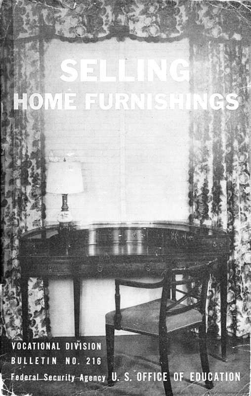
Figure 29.—This fernery server, part of a new eighteenth century dining-room suite, gives the new interpretation to functional pieces in period design. The attractive server with compartment for glasses and a service shelf for plates, cups, and the like, is equipped with two metal plant containers. The rug is an all-over textured olive green Axminster.
Unit VII.—AN INTRODUCTION TO THE ART OF INTERIOR DECORATION
INTERIOR DECORATION AS A SELLING METHOD
The art of interior decoration is the skillful use of furnishings in keeping with the architectural factors of a room to create a harmonious setting adaptable to the social, economic, and personal use of the occupants.
A room may be said to be beautiful if it gracefully, effectively, and adequately fills the purpose for which it is intended and takes into consideration the habits of all members of the family using it.
The salesman who creates a room which adequately and harmoniously fills the purpose for which it is intended—taking into consideration all of the personal and architectural factors—may be satisfied that he has done a good job of interior decorating.
Comfort and beauty.—Comfort can be created through proper exercise of care and common sense. Everyone knows what comfort means, and is able to recognize it. But in the case of beauty, no one knows precisely what it means and many people are unable to recognize it.
The facts are that, although beauty is beyond definition, it will appear in the presence of certain conditions; that these conditions may be defined and controlled and discussed intelligently and convincingly with customers. What these conditions are, and how their presence may be insured by means of the merchandise, will be set forth in this unit and in the four units which follow. For our present purpose it is enough to say that one of the conditions of beauty is harmony, and that any room will have a considerable measure of beauty if its furnishings are harmonious.
A well-furnished and decorated room will have colors, contours, and groupings that fit into the architectural background as though all were conceived and executed simultaneously. The salesperson should guard against the customer's rather natural feeling that there is inequity between cost and the characteristics and qualities which give harmony and beauty to home furnishings. In handling a sale at this point, the salesman will develop convincingly the idea that home decoration, although it is the distinguishing mark of all lovely homes, actually is not dependent on lavish expenditure. Personal comfort, reflection of individuality, dominant unity, and harmonious groupings result from careful planning and educated tastes rather than from loosening the strings of a heavy purse. After all, the basic consideration is suitability, not decoration.
The salesman who will assemble a harmonious grouping quickly and keep it within the customer's price range will accomplish two important things:
1. Focus attention upon beauty and satisfaction of harmonized groups instead of directing worry toward price and minor details.
2. Increase respect for his judgment and understanding of her problem.
Suitability means comfort first.—Every well planned sale of home furnishing materials starts with the assumption that the buyer is always thinking in terms of her own interests. She has little or no concern with the construction, design, style, prestige value, or price of any article unless she believes that her own interests will in some way be affected by it.
Suppose for instance she has read several of many articles which appear from month to month in magazines covering the home-furnishings field, and that she has attended lectures on home decoration. She may even have discussed particular problems intimately with several interior decorators. She understands that she should never buy just for the present with the idea of making replacements later. She long since has given over the idea of wondering what the neighbors will think of her selections. Before she faces the bewildering walk down aisles flanked with sofa beds, lighting fixtures, tables, chairs, beds, draperies, consoles, carpets, rugs, and chaise lounges, she has planned her room on paper and has visualized the picture in terms of color and often has decided on a color scheme. Furniture has been given a diagram placement on paper to conform to wall spaces and windows. Rugs, draperies, and accessories have been subjected to tests of suitability for the purposes for which they are to be used.
When the salesman finally faces her in the first vital moments of this sales effort he quickly will realize that she knows what things she wants to see, their styles, shapes, sizes, and even their colors. Without knowledge of at least elementary principles in the art of interior decoration he is certain to feel a sense of inadequacy, even of humiliation. Even with the requisite basic information, normally it will be a sheer waste of time to assure her that any article is handsome, finely made, fashionable, or even that it is a wonderful value until he is sure that she considers this piece adapted to her own situation and needs. Innumerable sales go on the rocks at this point.
Interior decoration as a selling method begins right here with the revelation of the customer's situation and needs. If she has ideas which are in the hazy, sketchy, and by no means certain stages, then the salesman must proceed to secure the information he must have in advance of any intelligent selling he may hope to do. Usually these customer situations and needs will depend on two factors, the one personal and the other architectural.
The personal factor involves such considerations as the age, sex, size, tastes, and habits of the members of the family; the amount and character of entertaining for which provision must be made; and the amount of money or credit available for new furnishings.
The architectural factor includes such details as the use, size, style, and situation of the room; its woodwork, floor, walls, ceiling, and lighting; its relationships with connecting rooms; and the size, style, and coloring of the furnishings already in use.
In employing this method, even in the simple sale involving the purchase of a single piece, the competent salesman will have three purposes in mind. The first is to insure that this new piece will fit the people who are to use it; the second, to insure that it will fit the room in which it is to be used; and the third, to insure that it will combine with everything else in the same room to form an agreeable harmony. In other words, he must use his merchandise to secure comfort through fitness or suitability to purpose and use, and to create beauty through harmony. Correct room arrangement is essential to both.
EMOTIONAL VALUES OF LIGHT, COLOR, LINE, AND PROPORTIONS
Everything used in furnishing a room may be resolved into its elements of light, color, line, and proportion. Psychologists have shown that colors influence the mood of an individual, and create emotional values which may be stated as follows:
LIGHT AND SHADE
To understand and correctly use light and shade, one must have a basic understanding of values and know how by using these values different effects may be achieved. Using as a key a scale of nine values (bearing in mind that the term value means degree of lightness or darkness without regard to any particular color) ranging from black to white, one finds that the grey tones toward the white end of the scale are light values and shade toward white; those toward the black end of the scale are dark values and shade toward black; in the center is a medium grey tone.
Using these values in terms of room colors, it has been established that light values are cheerful and gay because they reflect light. When used in pastel tones they are feminine and friendly. On the other hand, dark values are sombre, heavy, and masculine in feeling since they absorb light and have a darkening effect. The middle tones are a happy balance and combine essentials of both values. Thus, kitchens, breakfast rooms, nurseries, playrooms, and boudoirs should be done in light values; libraries, men's rooms, or lounges in dark values and living rooms and dining rooms in medium values, using both dark and light.
COLOR TERMS
Although there are many technical color terms used by advanced colorists to distinguish variations in colors, there are just a few basic facts to remember to help you understand and use color to the best advantage in interior decoration. Hue is the pure color neither mixed with white, black, nor a complementary color. A hue may be a primary color, secondary color, or tertiary color in its true value. When you mix a hue with white it becomes a tint; when mixed with black it becomes a shade; and when greyed with a complement it becomes a tone. Since walls should be lighter than the floor covering, walls are usually done in a tint; floor coverings in a shade or tone or a particular hue, and furnishings either in the pure hues in adjacent or complementary colors or in tones, tints, or shades of these hues.
Primary, secondary, and tertiary colors.—Primary colors are the three basic colors known to man which cannot be produced by combining any other colors, but which, when combined in proper proportion, can produce every color known to man. These colors are red, blue, and yellow.
Secondary colors are hues obtained by admixture of the primaries and consist of violet (red and blue); green (yellow and blue); and orange (red and yellow).
Tertiary colors.—These are hues obtained by admixture of the secondary colors with the primary colors and consist of red-violet or plum; blue-violet or a deep, marine-type blue; blue-green or aqua-marine; yellow-green or chartreuse; yellow-orange or tangerine, and red-yellow or a warm red or vermilion color.
Complementary and adjacent colors.—Complementary colors are the colors directly opposite each other on a color chart made up of the primary, secondary, and tertiary colors, and when used in pairs they intensify each other.
Adjacent colors are the colors which follow each other in a color chart made up of the primary, secondary, and tertiary colors and they may be used together with an accent of a complementary color.
Elementary color chart.—To properly understand these terms and imprint these color combinations in your mind make this simple color chart in color using the three primary colors. This chart also may be worked out in pencil in a few minutes time and referred to when making color suggestions:
Figure 30.—Color chart. Numbers indicate: 1, primary colors. 2, secondary colors. 3, tertiary colors.
Draw a circle 4 inches in diameter. Divide the circle into three equal parts by lines radiating from the center. Label these three lines, red, blue, and yellow; they are your primary colors. These lines represent the admixture of the primary colors and represent violet, green, and orange. (See chart.) Now fill in the tertiary colors. (See chart.) When doing these in colors you will see the colors change and blend into each other as they are applied.
From the above color chart you can make any harmonious room combination. For any true harmony all three of the primary colors should be present. It is not necessary, however, to have three colors; a secondary color (made by blending two primary colors) would use the third primary as a complement. Look at the chart; you will note that green (made by mixing blue and yellow) has red as its complement. A third color in the room might be yellow or blue, yellowish-green, or blue-green. This is termed a complementary color scheme.
When using an adjacent, or monochromatic color scheme, any series on the color chart may be followed; for example, green, blue-green, blue, blue-violet, and violet. The complement or accent to this color scheme would be the complementary colors, orange, yellow-orange, red-orange, etc.
Before applying these principles to room schemes, there is one more rule to bear in mind. All colors in which red or yellow predominate are known as warm colors and colors in which blue and green predominate are known as cool colors. Since warm colors are more intense and tend to be exciting, they must be offset by cool colors, usually in the ratio of two to one, since it often takes two cool colors to balance one warm color. It is also well to remember that deep colors "advance" and light colors "recede." An oblong room can be made to look more square by doing the short walls in a deep green, the long walls in a light green. Primary and secondary colors are more intense than tertiary colors—colors receding and lightening with the admixture of additional hues.
Building a room scheme.—Taking all of the above facts into consideration, it may be interesting to work out a few simple color schemes for a living room. Assume that one wishes to do a "blue" room. The predominating color in the room will, of course, be blue. However, let us suppose we do not particularly care for a blue rug. Since the second largest piece in the room is the sofa, we have decided to use a blue sofa. We have two definite choices for a rug; it may be a greyed tone of red or wine color, or a greyed tone of yellow (beige or light brown). If we select the red-tone rug, we must think about our yellow tone for the complementary chair. Let us suppose we decide upon a tint of yellow or beige. A third chair now may be a secondary, or tertiary, of these three colors, and since our room is predominantly blue, we select a blue-red or violet color. Violet, you will notice, is a perfect complement to yellow. We might have used a shade of red or wine color as a complement but it would have given a red tone to the room.
For draperies we have several colors from which to choose but we must take into consideration the wallpaper. We may use a tint of the floor covering, or the sofa, or may bring in the third primary color. Let us suppose we had decided to use a tint of the floor covering or a soft pink tone. Our draperies now may be blue, blue-violet, or red-violet. Accents necessarily would then be red or orange. If wine-colored draperies were used, we would have practically an equal balance between red and blue, and our accessories would be yellow.
Another popular method of color coordination is to repeat the colors found in one piece with plain colors or novelty weaves emphasizing the colors of the figured fabric; for example, a room may have a blue sofa with a tiny pink figure worked into the tapestry. One of the chairs, then, could be pink in the same tone as the small figure; the other chair would then be one of the yellow tones, and could be either beige, or brown.
Some decorators repeat the floral colors of printed draperies in the room setting. Some combine the plain colors of the sofa and chair in a figured third chair which has a neutral background and picks up the colors of the other two pieces. It is well to mix the patterns in a room, a stripe combining nicely with a plain color, and a small figured mixture carrying out the third color and blending the striped and plain tones.
By referring to your chart you will discover many interesting color combinations. Just remember that adjacent colors take the opposite complement as accent. Complementary colors may be used with adjacent or with a third primary color, or with a combination of two primaries on a neutral background of the third color.
LINE AND FORM
Straight lines create an effect of strength, virility, and seriousness, and, if exclusively employed, of austerity or hardness; while curved lines create an effect of flexibility and joyousness, and, if, exclusively employed, the effect is one of weakness.
Horizontal lines and shapes arouse a sense of calmness and repose; vertical lines and shapes, of activity and life; diagonal lines and shapes, of movement. Long straight lines create an effect of dignity. When two colors are used together a line is created and these lines have a distinct effect upon the room in which they are used.
PROPORTION
Proportion, which is simply the relation of one dimension to another, applies throughout the house to walls, floors, ceilings, doors, windows, chairs, bookcases, tables, and other furnishings. Good proportions are never top-heavy, squatty, or uninteresting. Large size and thick proportions suggest strength, weight, permanence, and dignity; small size and slender proportions arouse the idea of delicacy, lightness, and grace.
It is well for the furniture salesman to understand a few simple facts which every good interior decorator knows.
Walls and floors, plus ceilings, determine the proportions of a room as a whole. Suppose a badly proportioned room is too narrow for its length and height—something common, for instance, to halls and dining rooms.
The apparent width of this too narrow room may be increased by—
1. Hanging a mirror, or using a picture in which the perspective is such that the eye follows a stream or broad expanse into the distance.
2. Using scenery wallpapers.
In well-proportioned rooms the wall decorations are lighter than the floor and the ceiling decorations are lighter than those of the walls.
SOURCES OF INSPIRATION
There are many avenues of study available to anyone who seeks the real enjoyment which comes with planning his own environment. Fashion ever has been a keynote in the purchase of home furnishings. The key, however, still remains in the custody of the owner. When she intends to buy a new gown, coat, or hat, she reads magazines and newspapers, shops around, studies styles and trends, thinks of uses and requirements for the gowns or coats under consideration. Probably she needs to understand that she may use as much conscious discrimination with furniture as with coats if only she will use the same sources of inspiration and information. She should try any one or all of these:
1. Monthly magazines with their superb color features, illustrating articles of great diversity.
2. Books from the public or from a rental library.
3. Model rooms set up in department and furniture stores, and in furniture shows.
4. Museums containing replica rooms done in the historical periods.
5. Paintings, as guiding one's thoughts for color schemes.
6. Newspapers which record style trends in attractive merchandise priced to meet the family budget.
If these studies are good for the prospective customer, how much more valuable they are for the progressive salesman who seeks to understand customer needs and desires in terms of human satisfactions.
SUMMARY
The results of studies of emotional values may be summarized as follows:
1. Variations in light, color, line, shape, and size affect the mind in certain fairly definite ways. When these variations are understood and controlled a group or a room may be given atmosphere which not only adds to its beauty, but also greatly helps in arranging it to meet the needs of the people who use it.
2. These emotional values of light, color, line, shape, proportion, and texture must be employed in such a way that the effect of each is increased by the effects of all:
Effects of restfulness and tranquillity result when—
a. The amount and intensity of illumination are reduced.
b. The tone of all colors is lowered.
c. Horizontal lines are predominant.
d. Large size is emphasized.
Effects of animation and activity result when—
a. The amount and brilliance of illumination are increased.
b. The tone of all colors is raised.
c. Vertical lines are predominant.
d. Small size is emphasized.
COLOR MANAGEMENT IN DECORATION
The moment anyone undertakes to furnish a home, that moment he begins to use color. Ross Crane, when conducting experiments in which color schemes for complete rooms were planned and executed step and step, determined that there are only four steps to take in building a color scheme.[15] These four steps are:
1. Decide on a dominant or controlling color.
2. Decide on the colors to go with it.
3. Bring these colors into the room in everything.
4. Accent the scheme by means of small objects (flower bowl and flowers, lamps, pictures, smoking trays) in high intensities of the leading color. These are the high lights that produce life and sparkle.
Another writer puts it this way:
In deciding on a color scheme for a whole room, fix on some foundation color, and then introduce relief and contrast.[16]
PLANNED PROCEDURE FOR THE SALESPERSON
With this information well in mind the home furnishings salesman will do well to leave learned and scientific discussion of color management to the scientists and concentrate on a few principal facts which will be dominant throughout the sales procedure.
He may be assured that his customer's decisions to buy furnishings for a complete room, a few pieces only, or none at all, will be conditioned by her likes, by the family budget, by the size and use to be made of the room, and by the necessity to use "left-overs."
He certainly will profit by having a rather definite knowledge of chromatic scales, complementary colors, adjacent colors, nuances, and concentric circles as devices which he may use to show how we get the many varied colors. It is the opinion of leading experts that the average salesman will find it far easier and more satisfactory to talk convincingly of color management for any given room or combination of rooms by using a simple color story which starts with the six basic colors, and which may be understood easily by the customer. If a simple color chart is close at hand and ready for use at any time, the sales talk will deal with facts, not generalities.
He must be able to take an inventory, by personal inspection or through questions, of the color possibilities in the decoration problem presented by the customer. Such facts as room exposure, size and type, wall color, floor covering, furniture already in the room; use to be made of the room, number, sex, and characteristic traits of those who will live, eat, work, or sleep in the room; and approximate price ranges must be known if real help is to be given.
He must know the stock so thoroughly that within the given price range, the designation of the proper color schemes will be comparatively easy. He must use his knowledge of color through the furnishings, to interpret, as needed, two different sets of ideas:
1. One in which the color scheme is daring, with unusual combinations, startling, gay, and sophisticated.
2. The other, with a color scheme recognized as gentle, restful, and never monotonous.
If he has a feeling of intimacy with both and will use his knowledge consciously to produce definite emotional effects, in a progressive series, he will see sales come as a reward for his effort.
THE SALESPERSON AS INTERPRETER OF APPRECIATIONS
When next you find a room in the home of a friend, in a model house, or illustrated in a magazine that awakens a response of pleasure when you first see it, stay with it long enough to find out why. Study the handling of color in curtains, rugs, chair upholstery, lamps, and bits of pottery; ask yourself where the abiding interest of the room is centered. Seek to uncover the secret of the spell this room casts over your senses. Unconsciously, you thrill to the thought that you, yourself, would never tire of such a room. It is the ultimate in color management.
This glorious adventure must be experienced by you, yourself. To you is given a power to enrich your appreciation of lovely things, and in turn to convey similar appreciations to your customers.
The salesman who has learned to exercise this power is far from being an order taker or even an order solicitor. Literally, he is counselor and guide—an interpreter of the store services which exist to help the customer, and the one to show the store management the need for expert customer guidance in color management.
If once, you, the salesman, have experienced the personal satisfactions of studying a room which has unmistakable distinction, which literally glows with the light of a personality reflected against a background of culture, understanding, and sympathy, you in turn will seek eagerly to share your adventures in color management with those who come to you seeking to express their desires and aspirations in terms of usable, lovely surroundings.
Difficult? The difficulty is in deciding to make the effort.
PRINCIPLES OF FURNITURE ARRANGEMENT
"Next in importance to the actual selection of furniture and accessories is a skillful and sensible arrangement of it all in a room. Every salesman should understand that in the placing of the furniture you may make a small room appear more spacious; a large barn-like one seem more cozy; express the idea of formality or informality; quiet restfulness or agitated confusion, sedateness or gayety, order or disorder."[17]
One secret of getting a homelike quality in the arrangement of furniture is to assemble it in small groups or units which suggest specific uses, as for instance a reading group, a writing or business nook, a rest corner, or a music section.
GET A CENTER OF INTEREST FIRST
If you are arranging furniture in the living room, decide on a central interest. Often this is called a built-up composition—table, be grouped. A fireplace with its cheerful fire-glow may well be a natural center of interest. (See fig. 31.) A window or group of windows opening upon a lovely vista may serve equally well. If the family is musical, the grand piano may be so placed as to become the pivotal point of interest.
Secondary centers of interest naturally are created once the fireplace, a window, or the grand piano is assigned to the major role. There may well be more than one of these secondary centers, i. e., a writing corner, and a reading group.
Objects of central interest.—Every wall should have an object of central interest. Often this is called a built-up composition—table, desk, cabinet, or couch standing against the wall—with, in each case, a picture, mirror, hanging bookcase, or tapestry above. The focal point may be a single tall piece of furniture such as a secretary or highboy. The pictures, mirrors, or tapestry hangings tend to build up a kind of "skyline" and the furniture is united with these wall decorations to create the necessary feeling of orderly stability which proper balance and color harmony can give.
BALANCE AND COLOR HARMONY
An effect of balance in the arrangement of the furniture is as essential to the comfort of the occupants of the room as proper lighting, easy chairs, or unobtrusive orderliness. In fact, it is a species of order. It gives a feeling of repose.
Figure 31.—Living room showing harmonious arrangement. View from living room to hall in a city apartment. Interior woodwork, mantel, and furniture are of wood in tones which range from the dark chest to the blond chair.
A room, or a group, is in balance when it appears to be at rest; that is when the total imaginary weight, or pull, on the attention, of everything on one side of a center appears to the mind to equal the total weight of everything on the other side. An accurate feeling for balance can be acquired easily by experiment and practice. There are two kinds of balance: Even or formal, known as bisymmetric balance; and uneven or "off center" known as occult balance.
Formal or bisymmetric balance.—The simplest form of balance is produced by placing two things exactly alike on either side of a center and at exactly the same distance from it. This is called either bisymmetric (double symmetrical) or formal balance—usually the latter because such an arrangement is somewhat stiff and precise in its effect upon the mind. To test it, exactly in the center of a piece of paper draw a rectangle 1 inch long and one-half inch wide. Imagine this to be a console table. Equidistant from this rectangle, in a straight line, draw two small squares (one on each side of the rectangle) to represent a pair of chairs. If you successively place a circle over the rectangle to represent a mirror, you will clearly see the bisymmetric balance. The effect of formality becomes more marked as you add more units to the group. While too many formal groupings will make the room seem stiff and unlivable, at least one formal grouping may be desirable in every room since formal balance affects the mind with a sense of stability and repose.
If the motive of formality is to be emphasized, the number and importance of formal groupings should be emphasized; if informality is desired, the use of formal balance should be limited.
"Off center" or "Occult balance."—There is another kind of balance, usually called "occult" because it is less easy to see or to create. It is produced by arranging a number of unlike things with reference to a center on the basis of the mechanical formula that the "weight" of each will increase directly with its distance from the center.
As an experiment in occult balance, draw a rectangle 2 inches long and 1 inch wide to represent an imaginary fireplace. One-fourth inch to the left of the exact center, and at right angles to the "fireplace," draw a small rectangle 1 inch long and one-fourth inch wide to represent a love seat. Now, one-fourth inch to the right of the center, and at right angles to the "fireplace" draw two ½-inch squares to represent two chairs. Together the chairs will seem to the mind to "weigh" about the same as the love seat, and the whole group will be substantially in occult balance. Now erase the "love seat" and exactly in the same position draw a rectangle three-fourths inch in length to represent a sofa. You will notice the balance has been destroyed. It may be improved either by moving the "sofa" closer to the center, which will make it weigh less; or by moving the chairs farther away from the center, which will make them weigh more. In order to create a perfect balance, however, the chairs should be separated and a small rectangle placed between them to represent a table and lamp.
The salesman, if he is wise, will suggest pieces which, after suitable arrangement, meet the real needs and tastes of the family whether those needs be musical groupings, game-corner groupings, or conversational groupings. It may mean the sacrifice of some rule of decoration to make or keep a place for a favorite rocker, a grandfather's clock, or a treasured piece, but careful planning can make such a piece either a featured asset, or an unobtrusive addition if appropriately arranged in a proper setting.
The master rule for furniture grouping.—There is one all-inclusive rule for grouping furniture: "Bring together in a convenient place, those objects which will be used together."[18]
So many rooms become mere collections of furniture that along with this master rule for furniture grouping is placed William Morris' little rule, "Have nothing in your home that you do not know to be useful or believe to be beautiful."
If a reading chair is placed in a room, make sure adequate lighting provisions are made, either by the addition of a small table lamp or a standing lamp. If possible, a table should be provided for smoking accessories, candy, or a bowl of fruit. If a "quiet" corner is desired, select one away from general room traffic. If the radio is a feature of the room, and the occupant likes to lounge in an easy chair while listening, place a comfortable chair near the radio. Remember that the chair also may be used for reading, so be certain to provide adequate light. Conversational groupings require two or more chairs placed close together with a table for refreshments.
PHYSICAL AND EMOTIONAL HARMONY
Speaking in general terms, it may be said that things harmonize, or go well together when they are more or less alike, and that they may be alike either because they look alike or because they affect the mind in the same way.
For example, if you cover a Sheraton satinwood bed with a fine silk taffeta spread in apricot, the two units will be harmonious because both wood and taffeta are in colors which contain a large admixture of the same hue, namely yellow. Moreover, they also will be harmonious because the fine lines and slender proportions of the bed affect the mind with a sense of delicacy and daintiness, and the fine texture, silken luster, and pale coloring of the taffeta affect it in precisely the same way. We can call the first type of harmony physical, and the second type emotional. Both are basically important in the art of interior decoration, and make surprisingly powerful sales levers in dealing with that 60 percent of potential buyers whose primary interest in furniture lies in what it will do to make their homes more attractive.
Tests for physical harmony.—There are numerous tests which might be made by a salesman on the floor such as placing a square white handkerchief on a mahogany gate-leg table and placing under it a pearl grey rug to illustrate inharmonious effect resulting from the fact that the three elements are unlike in hue, tone (degree of light and dark), defining lines, shape, and texture.
A much simpler method is to compare room harmony with ladies wearing apparel. Let us suppose a woman put on a brown dress, white belt, and pearl-grey shoes. Of course, the effect would be most inharmonious. On the other hand, suppose she substituted a gold belt and brown shoes. A harmonious effect would be achieved as was done in the instance previously referred to, in which a dull gold velvet or satin, folded to the same width as the table, was laid on the table and a deep warm taupe or mahogany-colored rug substituted for the pearl-grey carpet.
Good rules to follow for harmonious physical harmony are:
1. All elements of a grouping should be united by a common strain of color regardless of whether that common strain is a warm or cool color.
2. All elements of a grouping should resemble each other in a textural effect.
3. Accessories should resemble the piece with which they are used in correct proportion to the whole.
Tests for emotional harmony.—Important points to remember when making tests for emotional harmony are:
1. Low illumination with areas of shadow is restful, but high illumination is stimulating.
2. Horizontal lines and long, low shapes arouse a sense of repose, but vertical lines and tall narrow shapes have the opposite effect.
3. Dark colors (like low illumination and horizontal extension) affect the mind with a sense of repose, but pale colors (like brilliant light and vertical extension) affect it with a sense of animation and activity.
4. Large, heavy objects give a sense of repose, but anything small and light produces the opposite effect.
Bearing in mind these facts, turn on the ceiling lights in a room and notice the stimulating effect. Now turn off the ceiling lights and light the lamps in the room. Study the effect and you will see that the lamp-lighted room is more inviting.
In like manner, tests may be made to illustrate each of these points, such as substituting two high-back chairs in a room for the sofa. You will notice immediately that the room is less restful.
| The scale of harmony | ||
|---|---|---|
| Blends harmoniously with— | Preferred color— | Contrasts pleasingly with— |
| Light blue, navy, light green, green, heliotrope, purple, lavender, and gray. | Blue | Olive, yellow, orange, cream, tan, brown, and dark brown. |
| Blue, navy, myrtle, light green, lavender, and gray. | Light blue | Olive, pink, cream, and tan. |
| Light blue, blue, navy, light green, green, pink, purple, gray, and brown. | Lavender | Olive, yellow, cream, and tan. |
| Blue, navy, myrtle green, light green, green, pink, maroon, heliotrope, gray, brown, and dark brown. | Purple | Yellow, orange, cream, and tan. |
| Blue, pink, red, maroon, purple, gray-brown, and dark brown. | Heliotrope | Navy, myrtle green, light green, green, yellow, orange, and cream tan. |
| Pink, red, heliotrope, purple, brown, and dark brown. | Maroon or wine | Navy, light green, green, olive, yellow, gray, cream, and tan. |
| Orange, pink, maroon, heliotrope, brown, and dark brown. | Red | Navy, myrtle green, light green, green, olive, yellow, gray, and cream. |
| Red, maroon, heliotrope, purple, lavender, and cream. | Pink | Light blue, light green, green, olive, and gray. |
| Olive, yellow, red, cream, tan, brown, and dark brown. | Orange | Blue, navy, light green, green, heliotrope, and purple. |
| Light green, green, olive, orange, cream, tan, brown, and dark brown. | Yellow | Blue, navy, myrtle, green, red, maroon, purple, heliotrope, lavender, and gray. |
| Yellow, orange, pink, gray, tan, brown, and dark brown. | Cream | Light blue, blue, navy, myrtle green, light green, green, olive, red, heliotrope, purple, and lavender. |
| Olive, yellow, cream, brown, and dark brown. | Tan | Light blue, blue, navy, myrtle green, light green, green, maroon, heliotrope, purple, and lavender. |
| Olive, yellow, orange, red, maroon, heliotrope, purple, lavender, cream, tan, and dark brown. | Brown | Blue, navy, light green, and green. |
| Navy, green, yellow, purple, and gray. | Myrtle | Red, heliotrope, cream, and tan. |
| Light blue, blue, navy, myrtle green, green, olive, yellow, lavender, and gray. | Light green | Orange, pink, red, maroon, heliotrope, purple, cream, tan, brown, and dark brown. |
| Blue, navy, myrtle green,light green, olive, yellow, lavender, and gray. | Green | Orange, pink, red, maroon, heliotrope, purple, cream, tan, brown, and dark brown. |
| Myrtle green, light green, green, yellow, orange, tan, brown, and dark brown. | Olive | Light blue, blue, pink, red, lavender, and cream. |
| Light blue, blue, navy, myrtle green, light green, green, heliotrope, purple, lavender, and cream. | Gray | Yellow, orange, pink, red, and maroon. |
| Figure 32.—Chart of color combinations.[19] | ||
SUGGESTIONS FOR ROOM COMPOSITION
Consideration of use will guide one to desirable groupings of various pieces. Consideration of balance will prevent placement of the pieces of heavy furniture on one side or one end of the room. Groupings of chairs and their accessories of lamps and stands should be made so as to foster social amenities.
The following suggestions for room composition have been offered by one specialist in the field of interior decoration:[20]
1. Furniture should always be arranged with the purpose of the room uppermost in thought.
2. Each individual piece should be placed so that it is convenient, so that its use is obvious, and so that it is not interfered with by other pieces nearby.
3. Pieces should be distributed so that circulation is not interfered with. Keep furniture away from door openings or passageways.
4. Furniture should be practically placed in its relation to the architectural or mechanical features, so that there is no interference with the use of such features. Particular attention should be given to the swing of doors, the opening of windows, and the operation of electrical or heating devices.
5. The location of movable pieces of furniture should be carefully studied for their compositional relationship to the fixed architectural features—doors, windows, built-in furniture, alcoves, niches, mantels, paneling, etc.
6. An agreeable balance of high and low pieces of furniture should be introduced. High curtained windows and doors may be substituted for high pieces of furniture in a composition.
7. The quantity of furniture used should not give the effect of either under-furnishing or overcrowding.
8. The distribution of the pieces should be relatively even. In a long room, one end should not appear crowded and the other end bare, nor should one wall appear more crowded than the one opposite.
9. Opposite walls should have similar groupings, or, if this is not possible, they should appear evenly balanced in quantity and arrangement.
10. Pictorial wall surfaces (scenic papers, mural decoration, tapestries, and large hanging pictures) should not be hidden by furniture or other objects to such a point that their visibility is marred.
11. Furniture should be related in scale to the size of the room. Large pieces of furniture creating heavy shadows or dark spots are inadvisable except in large rooms.
12. Furniture placed with lines parallel to the walls gives a greater effect of unity in a room than when placed in diagonal positions.
QUESTIONS
1. A customer asks: "Is it absolutely necessary to have a pair of these tables? Or can I get a balanced effect without having everything just like soldiers lined up precisely?" How would you demonstrate an answer?
2. What phrases or words have you found which seem to make a favorable impression on a "typical" customer, without overdoing the decorative approach?
3. How would you employ color to make a small room seem larger?
4. Explain the emotional appeal of color. Under what conditions would you employ violet? Yellow? Gray?
5. What color scheme would you suggest for painting or papering the walls of a room which has a northern exposure?
6. "In the living room, family life should center, * * * and guests find friendly greeting." To the interior decorator as to the furniture salesman, this means grouping. What groups should a living room have?
7. How many of the common color names are important in selling goods in your store at this time and how may you learn and apply them to your merchandise?
8. Discuss the proposition that you are not properly equipped to meet special color demands when stock merchandise cannot be sold.
9. Discuss the principles involved in getting the proper color treatments for connecting rooms.
10. To what extent should a furniture salesman attempt to understand the art of interior decoration?